I love my clam guys. I don't know how we started doing this but every now and then when they get off the boat they text me "want any clams today?" and I text back YES and they come over and I buy them fresh, from the water to the boat to the van and right to me. It's beautiful.
There's two of them, Joe DeGeorge and Tim Sound. They used to go out together on Tim's boat, and then Joe got his own boat, and then that's when I insisted that they get a flag for their fleet. I also insisted that I design it. Then I did design it, and had it manufactured by professionals. I did a great job, which I'm sure is no surprise to my saintly and beloved readership. Hello out there!
Here's the presentation I gave my clam guys, which I was going to email over to them but then as I was working on it they texted to say "do you want clams" and then I was able to give them the spiel in person:

In keeping with the times, I tried to do both a flag and a logo for you guys. I think I did a great job honestly.
As a flag it's iconic and unmistakable-- I was careful to avoid any similarity with any current nautical flag or country flag so there can be no mistake out on the water. Even from a great distance I think it'll be identifiable and unmistakable.
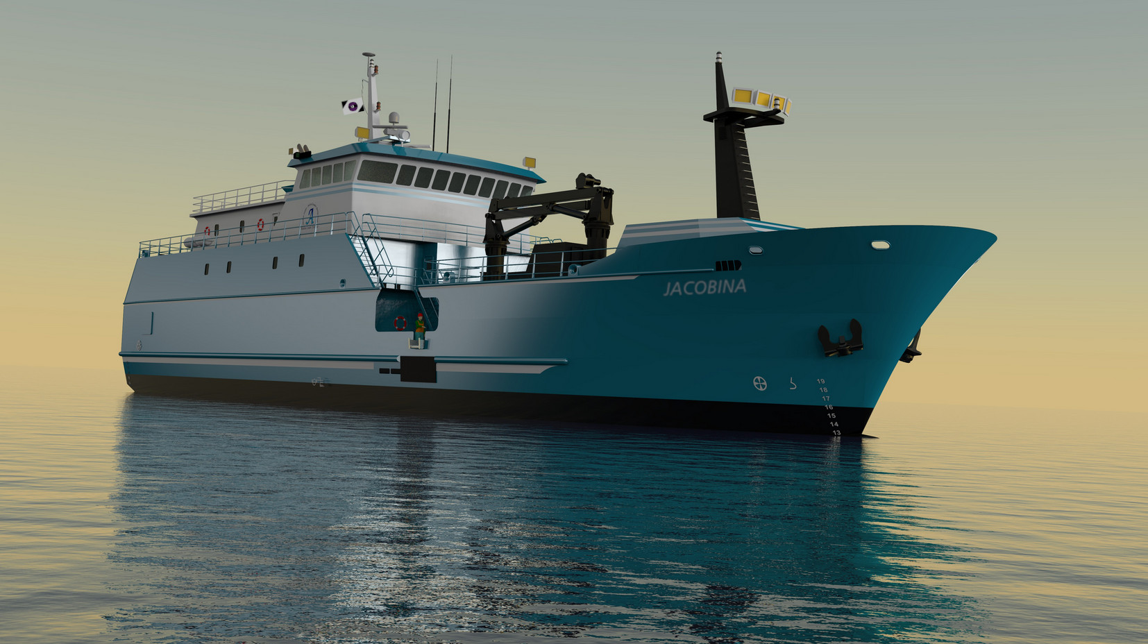
Purple isn't really used in flags, I think it's because [citation needed] in the era of nation-formation purple dye was too expensive, and/or was reserved for royalty. It feels good to put purple on a flag.
The shade is variable but I went with EZ Pass:
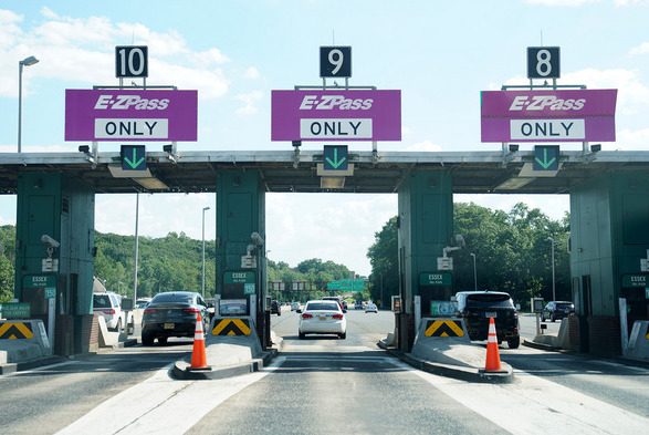

I thought this was a good message to include on a nautical flag-- "I am authorized for safe passage". Or maybe it's more like "I've paid my dues".
By keeping the color count low and having a default white background, I made it cheaper to print on a t-shirt. I know this isn't lost on you guys.
Flags always have some kind of symbolism grafted onto them after the fact. And this one does too! I was thinking that the upper left and lower left shapes, when viewed at an angle from which a nautical flag might be hung, represent the bottom of the boat and the bottom of the sea floor. The clam is inbetween. Is it being pulled up, ready to be brought to me personally? or is it being thrown back, in the spirit of regeneration? Both are valid.
(At this point Joe interjected and said that they don't really throw them back, but then Tim said "What about The Warrior?". Joe said "Oh right. We threw The Warrior back." The Warrior????)
There isn't really a standardized ratio of flags, it runs the gamut from square stumpy Switzerland (1:1) to long luxurious Qatar (11:28). There's no standard, but I learned that the Olympic committee edits all flags down to 2:3 during the games, for ease of manufacture. So it's not like you guys are going down that route (nationhood 🠆 sports) but that's what I went with, 2 units high to 3 long. But the design is easily extensible to other formats. If you guys want a long one to wave behind a horse at the start of a parade, or you have the opportunity to paint it over a basketball court, a new design would be trivial to accomplish. Not a problem.


And just a note about the legality of flying a weird flag at sea-- there seem to be a lot of rules about flags on boats but as far as I can tell all the rules are about prohibiting the flying of specific flags in inaccurate circumstances. Like you can't fly the "I have leprosy" flag combo if you don't really have leprosy. It isn't just in poor taste, it's also against the Law Of The Briny Deep. Anyway you should do your own research but I feel like there's no prohibition on "I made this flag, it means 'this is me'". See search term "Private Signal".
As a logo, wow, it's great. The clam alone would make a great sticker or letterhead. It's simple enough that anyone could redraw it, while the original official version retains the touch of the artíste, with its rugged shell and biologically inaccurate dewy anime eyes. You could do a super minimalist version for the side of your corporate compound, or a very gnarly and warty version for Halloween. It's iconic but not generic, and works equally well in full color, greyscale, halftone, or black and white.
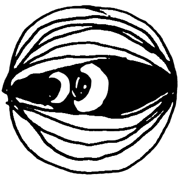


also works fine as a 64x64px folder icon:

Like any good modern logo, it's able to be manipulated while still staying recognizable and true to form. I really think this is essential in today's media environment. The eyes can be shown looking in another direction if that's needed for riff reasons, I don't think that's a big deal. The only thing I'd insist on is that the outline of the clam itself should be roughly a circle.
Here's some variants I drew up without even thinking too hard. Any of them would be great for a special event, t-shirt, or flyer.
Italy:
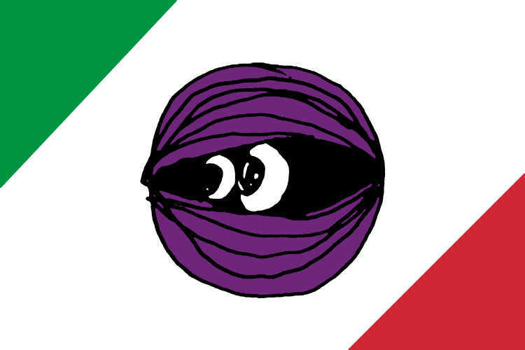
Mexico:
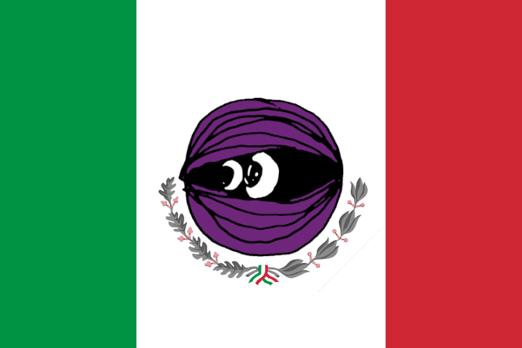
Ireland / the Ivory Coast
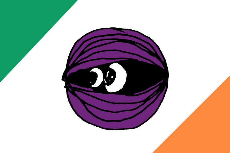
Pride (original 8 stripe 1978 version)
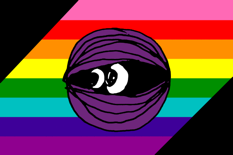
Tibet
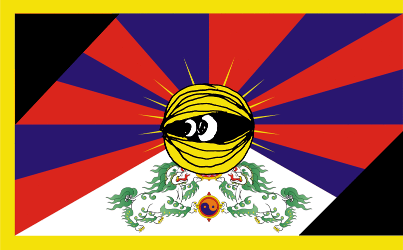
Japan
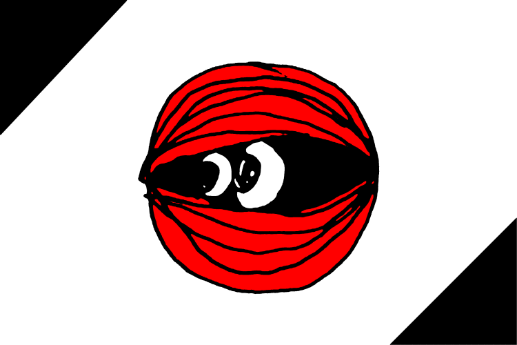
etc. etc. etc.
stencil:
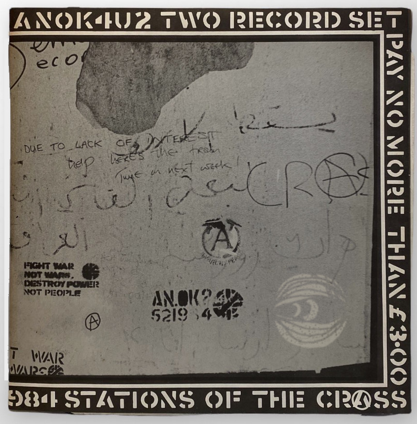
and while we're here,
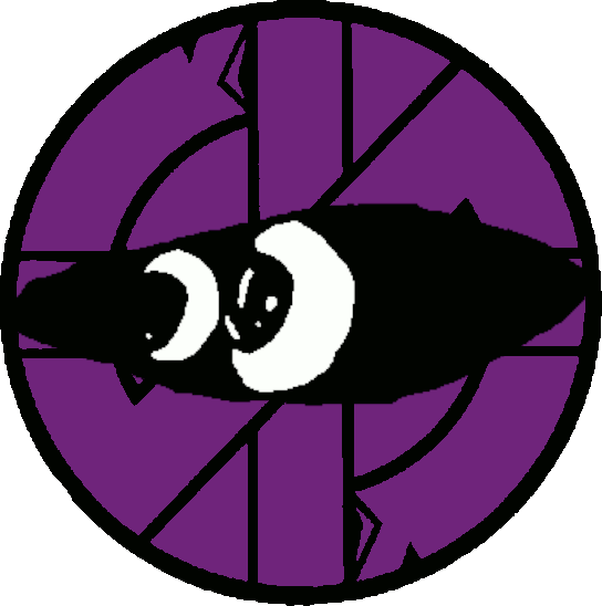
That's as far as I got in writing when they buzzed me, which is fine because they didn't need convincing, they said yes, big time, let's rock, or something equivalent in meaning, tone, and enthusiasm. I sent the file to the flag people and had 2 made, one for Joe and one for Tim. Here's Joe with his:
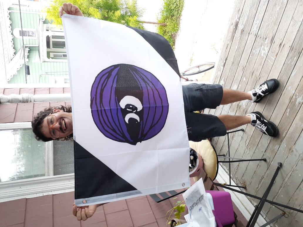
Shoutout to my motherfuckin CLAM GUYS for insisting that I get 6 months of clams as payment!!!!! I love you guys!!!!!
If anyone needs a flag or logo designed, hit me up!!! I'm SO thoughtful AND I love the game!!!! I'm like Saul Bass for punks! I guess my current rate is "a lot of clams"????
links / misc
- Thank you to everyone who has signed up so far for the Fujichia Feast Society! We're already at 30% of my subscriber goal, which is incredible. If this type of thing is worth $6 to $12 a month to you, consider signing up! you get weekly emails AND a quarterly newsletter AND 10% off all my other stuff and maybe... more???? And you'd be helping me keep the lights on while we chug e'er forward towards the 1000 year anniversary of the castle, in 2999AD. Check it out: [link]
- Joe's in a band with superstar Victoria and Famous Joey, plus two other people who I'm sure are great but I don't have enough experience with them to issue superlatives. The band is called Downtown Boys and they have a new record out, check it out-- [downtownboys.bandcamp.com]. He has many many many other great projects, this is just the tip of the iceberg!
- I don't have any links for Tim Sound, but he rocks too. One time they brought me a bunch of large clams and said "these would be better for stuffies", and then Tim gave me his family's stuffie recipe:


- here's a cute pic of all of us together in the pews of Manning Chapel for the 2024 Bach To The Future marathon:

- In writing this I learned that the Pride Flag was inspired by the Rolling Stones song "She's A Rainbow". That's not my favorite band in the world but, well I guess you never know what someone's going to groove on and where they're going to groove it to!
- flag resources / other reading:
- [wikipedia: vexillography]
- [wikipedia: List of national flags of sovereign states]
- [wikipedia: maritime flags]
- [wikipedia: international maritime signal flags]
- [wikipedia: private signal]
- [wikipedia: gin pennant]
- sorry, this one needs it's own bullet point, this one's great: [wikipedia: gin pennant]

- There's a new chapter of Mickey Zacchilli's celebrated new adventure comic GAR, we're on chapter 5 now. You can read the whole thing here in the castle, in a special collection I maintain because I don't like how Substack displays the images: [link]
If you got here through a link, click here to go outside and come back in: [outside]
Archives of previous posts is here, in the coat room: [coatroom]
To sign up to get these posts in your email for free, click here: [substack]
To write me a nice message, use the contacts page: [link]
To leave a little donation to help in the maintance of this castle, OR to simply hear the sound of a large bell, which is good luck, visit the temple area: [link]
As always, if you're bugging out or need a respite from endlessly scrolling the feed, you are welcome to hang out in the castle as long as you want. :)

Comments
Loading comments...
I'm working on something fun with this, with like, cool little icons. but for now all this does is allow you to sign your name in a way that identifies you as the writer, so no one can spoof you. And it turns your name gold. :)
[close]