Mike Leslie Flyer Collection
 I'm going through more stacks of paper right now, trying to sort things into piles in preparation for a "collections" section on the website. I don't really have a good analog for where in a castle the collection of old flyers goes-- in a section of the library I guess? Or more true to life, maybe there are boxes piled up in an unused bedroom? Anyway before I set up a whole zone, I figured I'd tease some stuff out. Here's my collection of flyers and other printed matter from Mike Leslie.
Mike's one of my oldest and best friends, he's a real gas. He never really prioritized having an artistic output, preferring to just jam in the living moment. Maybe that comes from his main practice, which is skateboarding. Anyway the bulk of his collectible work is flyers, something free to hand out. There's something special about that. Besides the flyers and record covers he did a few zines, had 2 shows of his larger work (at the Dirt Palace in Providence and Orchard Skate Shop in Boston), sends drawings to his pen pals, and puts a lot of great stuff down in a sketchbook. And he's in great bands, which is also why there's so many flyers. Bands of note include Terribles, the Dungeoneers, Funeral Cone, and the Humblebees.
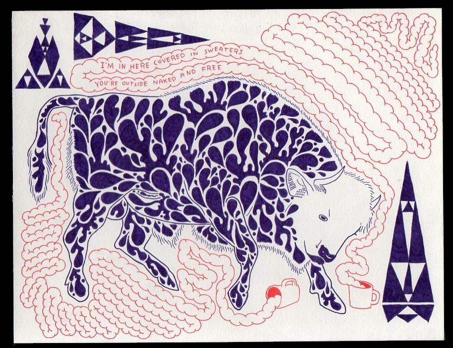
The majority of these flyers are A5 sized handbills, half the size of a piece of 8.5x11" paper. Most are xeroxed, though some are screen printed. Most of these are for shows in Worcester MA, where Mike and I both lived for many years. They are presented here in no order. Some of these were labored over, some were just something to make quickly so that people knew about the show as soon as possible. That's important! Most were drawn in multiple colors of Micron pen (strictly Micron) and then xeroxed down to gray, which drove me crazy. Some were obviously copied right out of the sketchbook. That's a cool thing about the flyer as a format, it's a light and breezy way to show people the new batch of drawings, the new set of obsessions.

This one has marks on it from being hung on the wall outside my door with duct tape.

Drawing with Mike is really fun and he has a great and infectious habit of just throwing words on the drawing-- song lyrics or whatever's echoing in his head at that moment. I guess this comes from Pettibon, although with Pettibon it seems labored, with Mike he's just dripping off the dome. Anyway it's nice, it makes every drawing into an abstract gag comic. This flyer is the first show I played back in Worcester after I moved out, I guess that's why I get the quote from Beach Boys "That's Not Me"-- "I once had a dream so I packed up and split for the city..."


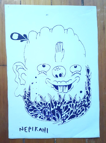
ML has a few things that he loves to draw- clouds, mixed-up faces, digital clocks, triangular spaceships... The one I love to see most of all is this hand throwing a cup away, which I believe is based on the trashcan at Pizza Queen. What this is about I do not know.
I don't know why I have an uncut version of this flyer, maybe that's the way it always was, like a playing card.


This one (above) and the next one (below) were from a time when Mike had wrist surgery and couldn't use his main hand. that's why the writing is shaky and the drawing isn't covered in small lines. "Switch" is from skateboarding, it's when you do a trick leading with your non-dominant foot, a mirror image.


Cleansing Wave... great name, sick band.


Mike moved into my room at the Go Go when I moved out, if memory serves correctly he pulled this 4-up xerox of Hugo Ball out of the trash. I was going to put it in a zine, then I didn't. Sorry Mike for leaving trash in the room when I moved out, I'm guessing I was in a huff.

Mike painted a huge shark on the wall for this party, and it stayed there for years because no one wanted to paint over it.

Mike only draws with Micron pens, and NEVER draws in black. Usually the main line color is purple, with additional linework in orange, blue, or green. The flyers were usually printed in black and white though, because it was orders of magnitude cheaper than color. I was always like "just draw in black, it'll look better when you xerox it." His logic was impeccable though: "I don't want to." Here's a rare one that was printed on someone's risograph, in green. Was "Eye Control" a band?


Julyoween was an idea I had for HBML, then when I closed the store down, the people that started a new junk shop in that location really ran with it, and had a haunted house. That's the way of the Great Idea! the blue stamp is from the comic book store-- you had to have them stamp the flyer before you hung it up in the store foyer.

Providence had a rich scene for silkscreened posters but it all flowed from RISD, where you could get professionally stretched screens out of the trash regularly. In Worcester we built our own screens, which worked fine for printing on t-shirts, which is pretty forgiving. But to print on paper you need a really tight screen, tighter than you could get by building it yourself. We could never get it right so for the most part we said no thanks to the trend. Here's a rare one (above), for an art show he had at Orchard skate shop in Boston.

This appears to be a jam drawing, containing what is probably the world's only Mallard Fillmore fan art??? Just sitting around a table passing a piece of paper around until the flyer's done. Ugh these parties were fun as hell. The last party I went to here they put "not a rager" on the invitation so no one would get their hopes up. That's... a pretty bad vibe. :(

Api Uiz was a sick band, they were from France and their name was just saying "Happy Whiz" in a French accent! Good Good also sick.

This house went through a few names in its first year, I thought "Discovery Channel" was inspired but it's not what they went with. I was calling it "Downhill Mansion" but that got vetoed too.

If I remember correctly the puppet show was just like, a set, they had 20 or 30 minutes of material and when they wrapped up they were like "OK, who's up next?". I thought it was going to be a big production. Anyway I was living at the Firehouse at the time and I felt embarrassed but I just said "the next act will be the movie Ghostbusters", and I put Ghostbusters on and the whole crowd watched Ghostbusters together. Turned a whoopsie into a great night.


Postcards printed for Mike's art installation in the Dirt Palace window. Two color silkscreen over existing postcards. I made sure to get the whole set. I'm guessing Xander printed these because that's her handwriting, with the Discharge "E".

Now that I'm looking at these here I'm thinking there's got to be another box with more flyers in it... There's some I'm remembering that aren't here. I guess I'll save those for a Part 2. Also all the best drawings were always on a postcard that he'd just send you in the mail... I gotta put those together too.
Some Extras
Mike did a few album covers, I don't have all of them for some reason
CDs:


front and back. Front cover is a drawing of JJB Buckmaster, back cover is (I think) skateboarder Frank Gerber?

CD cover for Snow Ghost's incredibly-named CD "Death, Despair, and Redempshire"


Front and back cover of Terribles "The Future As Seen From The Future / There's Too Much Everything". Terribles was Mike's band that started in the 9th grade, with JJB Buckmaster and Matt Carroll.
7" records


front and back of the Onion Flavored Rings 7". This is one of Mike's favorite bands, so sick that he got to do the cover. Oddly enough it's based on the label art for Fat Day's "Cats Of The World" LP.


There are also 2 more 7"s I don't have (unlikely) or can't find (likely). There's one from Drunken Boat and one from Foreign Objects.
Other


OK this one (above) is from JJB Buckmaster, drawing in a ML style. The Terribles had an arrangement where they shared the cover duties, and this one was Mike's turn, but, well I forget what happened but Jamie drew it. You can tell because the spaceships (triangles) are too regular. And they're a repeating pattern, rather than "a couple space ships". Like all Terribles records, this one is great.
Stickers

Mike Let me scan in some drawings from his sketchbook to make stickers for the sticker machine at HBML. These were cheap-o's, not vinyl, just printed onto sticker paper.
At one point I got my hands on a huge roll of vinyl sticker paper and had Mike draw out a bunch of face parts and then an empty face next to them, so you could cut out the face parts and stick them on the face and make your own Mike Leslie drawing, that was itself a huge sticker. I wish I still had a full sheet. Actually I wish I had 1000 full sheets. Anyway all I could find are two that I put together. Again, he drew the original parts, I put them together.


Mike had a few nice vinyl stickers pro-printed, and he put them into a little pack to give out or sell at shows. The packaging is above and the stickers are below.

This bottom sticker was also made into a t-shirt for Orchard.
There was also an earlier set of stickers in packs that were all green on white, and I'm sure I saved a full pack somewhere but I tore my room apart and only found this one:

I think I had so many of these at one point that I gave them all away, now I have just this one. Cripes...
More in Part 2, when I find the other box!
links/misc
- FANG Community Bail fund- [gofundme]
- Pueblo Relief Fund- [link]
- There's more great ML artwork on his TUMBLR. [tumblr]
- You can download / listen to Terribles records (all of which are good) on Greg's blog, Remote Outposts. Here's a link to the tag "Massachusetts", which should contain all the ML bands, plus anything else from that state: [link]
- the Snow Ghost CD is online too, it's a great one for the Halloween season. Download IF YOU DARE [archive.org]
If you got here through a link, click here to go outside and come back in: [outside]
To sign up to get these posts in your email for free, click here: [substack] To write me a nice message, use the contacts page: [link]

<< archives / coat room
<< front page
copyright Fujichia
